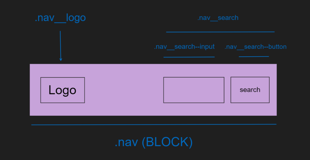
Being able to correctly organize and abstract code into smaller pieces is essential for all code, but especially CSS. When it comes to large, complex frontends SASS is one of the best ways to correctly structure CSS.
Nothing pairs better with SASS then BEM methodology. Which stands for:
- Block
A block represents a component or object on your website. At the end of the day, we as software developers spend most of our day organizing chunks of data. The most common types of blocks are header, content, sidebar, navbar, and search.
.nav {

}- Element
An element is a smaller sub component within that block that performs a particular function.
.nav__logo {

}
For example, say we had a logo within our nav component. A logo would be a smaller sub component of the nav that we can separate with two underscores __.
- Modifier
A modifier is how we represent different appearances and behaviors or what is commonly referred to as flags.
Modifiers differ from element modifiers in the fact that they use double hyphen --.
SASS/BEM Best Practices
BEM is very powerful for organizing your UI.

The nav block is the biggest piece of the UI and contained within are smaller elements and modifiers.
If we were to convert this UI component into BEM format it would look like:
<nav class="nav">
    <img class="nav__logo">
    <form class="nav__search-bar">
        <input class="nav__search-bar__input">
        <button class="nav__search-bar__button">
    </form>
</nav>
As with any software application, it is critical to organize your files in a correct manner. BEM provides way to organize CSS with hierarchical.
nav/
    search/
        /input
        /button
Using BEM with SASS
Very similar to nesting of the HTML, we can nest SASS selectors to correctly target elements in our HTML.
.nav {
    &__search {
        &__input {

        }
        &__button {

        }
    }
}
The sass code will then compile into raw CSS:
.nav__search {}
.nav__search__input {}
.nav__search__button {}
To further modularize our code we can even include SASS mixins for BEM.
SASS Mixins and BEM
As long as CSS rules are short and the base selector is simple, most CSS is perfectly readable. When things get more complex, BEM can make it difficult to interpret code. Mixins are handy to reduce duplication:
/// Block element
/// @param {String} $element - Element's name
@mixin element($element) {
    &__#{element} {
        @content;
    }
}
Which in turn can be used like this:
.nav {
    @include element('search') {

       @include element('button') {

       }
       @include element('search') {

       }
    }
}
The 7-1 Pattern
BEM also pairs well with folder architecture. The 7-1 pattern is a great way to not only understand BEM, but organize your code into components.
- base/
- components/
- layout/
- pages/
- themes/
- utils/ (some people call this “abstract”, but I think “util” is more explicit.
- vendors/
All of these folders are tied together in a single folder called “main.scss”
sass/
    utils/
        _variables.scss
        _functions.scss
        _mixins.scss
        _placeholders.scss
    base/
        _reset.scss
        _typography.scss
    components/
        _nav.scss
        _carousel.scss
        _hero.scss
    layout/
        _navigation.scss
        _footer.scss
        _header.scss
        _sidebar.scss
    pages/
        _home.scss
        _profile
    themes/
        _admin.scss
    vender/
        _bootstrap.scss
_main.scss
Sass and Breakpoints Best Practices
Responsive SASS with BEM is often an overlooked topic and SASS/BEM can provide best practices to follow.
In order to easily locate media queries, it is recommended that you keep the media queries at the root of the declaration instead of nesting them inside a selector.
.nav {
    .__search {

         @media (min-width: 568px) {
             //Code
         }
     }

    .__button {
     }
  }
It is better to keep media queries near the root of selector instead of deeply nesting:
.nav

    .__search {
     }

     .__button {
     }

    @media (min-width: 568px) {
        &__area {
        }

        &__section {
        }
     }
   }
}
Second , let’s build a breakpoint manager with SASS:
$breakpoint: (
    'medium': (min-width: 800px),
    'large': (min-width: 1000px),
    'huge': (min-width: 1200px)
);
Before coding anything, it’s a good practice to remember not to name properties off
Once you have name your breakpoints the way you want, you need a way to use them in actual media queries.
// Responsive breakpoint manager
// @access public
// @param {String} $breakpoint - Breakpoint
// @requires $breakpoints

@mixin respond-to($breakpoint) {
    $raw-query: map-get($breakpoint, $breakpoint);

    @if $raw-query {
        $query: if(
           type-of($raw-query) == 'string',
           unquote($raw-query),
           inspect($raw-query)
         );

         @media #{$query} {
             @content;
         }
     } @else {
        @error 'No value found for `#{$breakpoint}`. '
         + 'Please make sure it is defined in `$breakpoint` map.'
According to BEM architecture, media queries belong within selectors.
.nav {
    color: #fff;
    @include respond-to('medium') {
       color: blue;
   }
}
SASS Scoping
Sass supports two types of variables: local variables and global variables.
By default, all variables defined outside of any selector are considered global variables. That means they can be accessed from anywhere.
$bg-color: green;On the other hand, local variables are those which are declared inside a selector. later, we’ll examine how we can customize that behavior.
Here we define a mixin and then the btn-color variable within it. This is a local variable, and is therefore visible only to the code inside that mixin:
@mixin primary-button {
   @bg-color: green;
   color: @bg-color;
}
SASS/BEM Naming Conventions
Besides the previously mentioned naming structure, it is also best to give selectors descriptive names.
//BAD
.blue-nav-bar {

}

//GOOD
.nav__sign-in: